This month, we're looking at Webydo, a hugely popular cloud-based web design platform that has made quite a name for itself in the last four years. Like most site builders we work with, Webydo makes it easy to create a beautiful websites without handling any code. What sets Webydo apart is an intense focus on professional designers, and a origin story to match.

Founded in Israel in 2012, Webydo differs from its many competitors by catering to the modern web designer. In fact, the platform was originally created as an in-house tool for a digital design agency. But soon after its inception it became obvious that it needed to be made available to designers everywhere. That same year, Microsoft named it one if it's 20 most innovative companies in Israel, and users began to flock to the platform. Last year, after analyzing feedback from 170,000 of its users, Webydo made major upgrades to it's speed and fluidity, and began offering a wider range of intuitive design capabilities.

Built around a Photoshop-reminiscent dashboard, Webydo lets users design their WYSIWYG projects, and then generates code to power the site. Thanks to its drag-and-drop interface and advanced features, like Parallax animation, Webydo users can create extremely interactive and attractive sites with relative ease. When you first sign up to Webydo, you'll see a four-minute introduction video. Don't skip it, it's well worth the time, covering the addition and customization of in-house elements and third party plugins, like POWr.
Like other giants in the CMS field, Webydo offers its users a choice of starting point. Pre-built templates come complete with images, fonts, and formatting. Wireframes provide only a basic structure. And blank canvases let you start fresh at ground zero. Your choice really depends on how much time you have, your level of experience, and how specific your needs are. For most beginner users, templates are a great choice, giving you the freedom to use your own images, styling, and color schemes, but saving you from the psychological challenge of staring at a blank screen. Check out this breakdown of the different templates and their best uses for more inspiration.

Once you’ve chosen a template (or wireframe), you can switch between the Design, Content, and Preview viewers to move and resize items, input your own content, and preview your site. Most design and content edits are extremely simple, whether you're changing fonts, rearranging elements, or pulling in images from your hard drive.

Simply open the correct view, and double click on a section to get started. The drag-and-drop interface makes it easy to arrange and resize all of your elements. And Webydo provides hundreds of free web fonts, and color schemes to streamline the process.

All of the standard website elements are available in Webydo's Elements Panel, from image galleries and menus to text fields and buttons. More advanced elements live in the Widgets tab, including the complete library of POWr widgets. Drag a Form Builder onto your site, or hook up your social media accounts with a Social Feed. Double click or drag the widget onto your page, then double click it to open the POWr Editor. Everything you need to customize the look and content of your widget lives right inside this pop up.

Webydo offers tons of features to bring your website to a new level. Not least among these is their “Pixel Perfect Responsive” tool, which allows you to decide precisely how you want your website to appear on different devices and screen sizes. If you have any questions or issues, Webydo has an excellent support page, complete with FAQ, video tutorials, a knowledge base, phone support, email, and live chat. And their online community is composed of experienced designers who are extremely active, suggesting new features, voting for favorites, and fueling discussions among fellow designers.

Thanks to a tight integration, POWr has been widely adopted by Webydo users.

Like the Cupar Development Trust, who subtly and flawlessly matched POWr Social Media Icons with the rest of their site.

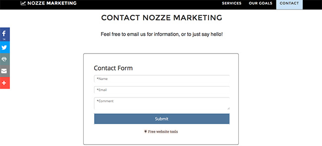
Or Nozze Marketing, where they've used a simple version of POWr Contact Form at the bottom of their homepage.

And Noah Love's personal website, which takes a similar approach to connect with visitors via contact form.
Have you ever tried Webydo? Are there certain tools or features you find particularly helpful? We’d love to hear about your experiences! Please let us know in the comments!